15 Web Design Trends in Restaurant Design Layout


The restaurant industry has been really slow to adopt web design trends. But more restaurants lately are now taking a chance and stepping out of the same boring cookie cutter restaurant web designs. The surprising thing isn’t the visual design (which has definitely made strides) but the actual layouts that many restaurants are now using. Here are some restaurant web design layouts to take notice of if you’re in the industry.
1. Long Form Sales Pages
Some restaurants are using long form sales pages to sell potential customers on their restaurant. They’re doing everything from highlighting the food, ingredients to the restaurant space to help their restaurant stand out.
2. Large Hero Images
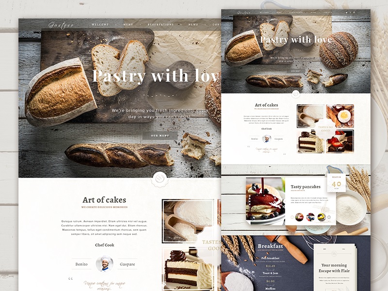
Hero images are in trend when it comes to restaurant sites. Large images that take up at half or even the whole page are being used. The idea behind this layout is to make a big impact with the visual presentation and get the visitors continue to browsing.
3. Minimalist Sites
Simple three to four page mini sites still work when it comes to restaurant sites. The only difference now is that most restaurants that use this minimalist layout have updated them with better graphic design and photography.
4. Visual Sliders
Restaurants are using visual sliders to highlight their restaurant space and give potential customers a visual sample of their menu. The benefit of using sliders in the layout is that it confines large images in a small amount of space so that users don’t have to scroll down.
5. Menu Only Sites
Some restaurants are going with a minimalist approach but putting the emphasis strictly on the menu. There are even some that have installed online ordering scripts to their web hosting service. This adds value to customers while eliminating the costs that they often have to pay to middlemen restaurant ordering services.
6. Brand and Story Oriented Design
Brand and story oriented designs can work in the restaurant industry. However, these seem to be used mostly for haute cuisine restaurants with customers that are willing to pay for fine dining experiences. You’ll find that this layout is very visual and tells a complete story from the ingredient sourcing, food, awards, cuisine style, to the chef behind the restaurant.
7. Full Background
Instead of using a large hero image, you may want to opt for a full background. A rich visual background that describes the restaurant can be just as impactful. Restaurants that are using this layout are often using graphical text to fill the content along the background or content boxes that don’t take away too much space from the background.
8. Landing Page Navigation
This layout is built for the user experience. What you’ll typically see is a basic presentation for the website on the top fold and a row of three web buttons underneath that lead to either the menu, address, about us or contact page. The layout is designed to lead users down their desired navigation path.
9. Left Hand Side Menu Browsing
Many restaurants layouts tend to avoid side navigation but it’s starting to make a come back. The reason why it works is that it reminds you of sitting in a restaurant and sifting through the menu. It also serves a great way to present a navigation for the restaurant’s menu.
10. Visual Navigation Buttons
Another approach to presenting menus is by using visual navigation buttons on the main page. The websites that are executing this layout well are the ones that are using enticing images of their food as links.
11. Widget Based Layout
Restaurants that want to condense vital information on their main page are using widget-based layouts. One widget may display the address and map. Another may display the menu. And there may even be miscellaneous widgets set up for social media updates and news related to the restaurant.
12. Brochure style
Some specialty restaurants like those that focus on vegan, vegetarian and gluten free foods are using a brochure style layout for their sites. The layout is packed with visuals and information that describes the cooking process, ingredients and other facts that they want their customers to know about. The designs also use varied layouts which are very similar to brochures.
13. Mobile Friendly Layout
Many restaurants are using mobile friendly elements like hamburger drop down menus and short pages with compressed images for their layouts. They’ll also use responsive designs to ensure they properly serve their mobile users.
14. Controlled Page Navigation
Restaurants that want to make sure their visitors are going through their presentation in a linear progression are using controlled page navigation layouts. They fit their content in one screen at a time and allow users to scroll to the next section by clicking a down arrow similar to image galleries.
15. Video Driven Design
Background videos or opening video presentations are also starting to be used by restaurants. These videos are great for presenting the food of the restaurant as well as telling the story behind the restaurant. Videos work well for small websites but well-known restaurants will need to find a web hosting provider that can handle all the bandwidth.
Those are some of the most popular trends in restaurant web design layouts. The layout you use will depend on the purpose of your site as well as the type of restaurant you own. The common theme that ties all the well-designed restaurant sites together are use of high quality photos, unique color schemes and a simple navigation menu. As long as you have these elements in place, you’ll be able to come up with a layout that works for your restaurant web design.


